Modernize Checkout
Buyers were dropping out right at the last step, most of all on mobile. I redesigned checkout around the four reasons they were leaving, and measured the result.
- Context
- StubHub’s multistep checkout had a large drop-off between ticket details and purchase, while competitors pushed hard on mobile.
- Role
- UX Lead. Led design direction and end-to-end execution, aligned cross-functional leads and managed stakeholders.
- Impact
- +9%mobile conversion+2.5%desktop conversion−18%accidental double purchases
Four problems, four design decisions
Research and analytics showed why buyers left. Each finding drove one decision, and each decision was tested against a number.
Higher drop-off on mobile than desktop
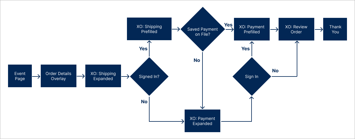
A long, multi-step checkout confused users, especially new ones.
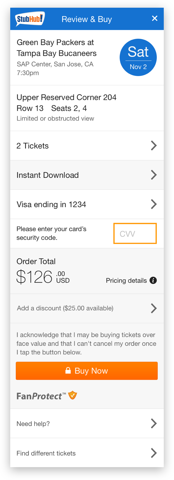
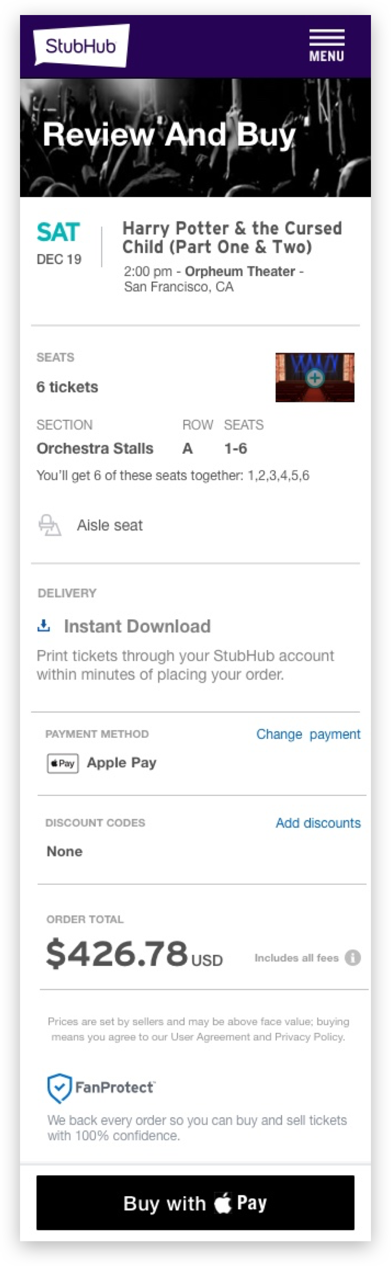
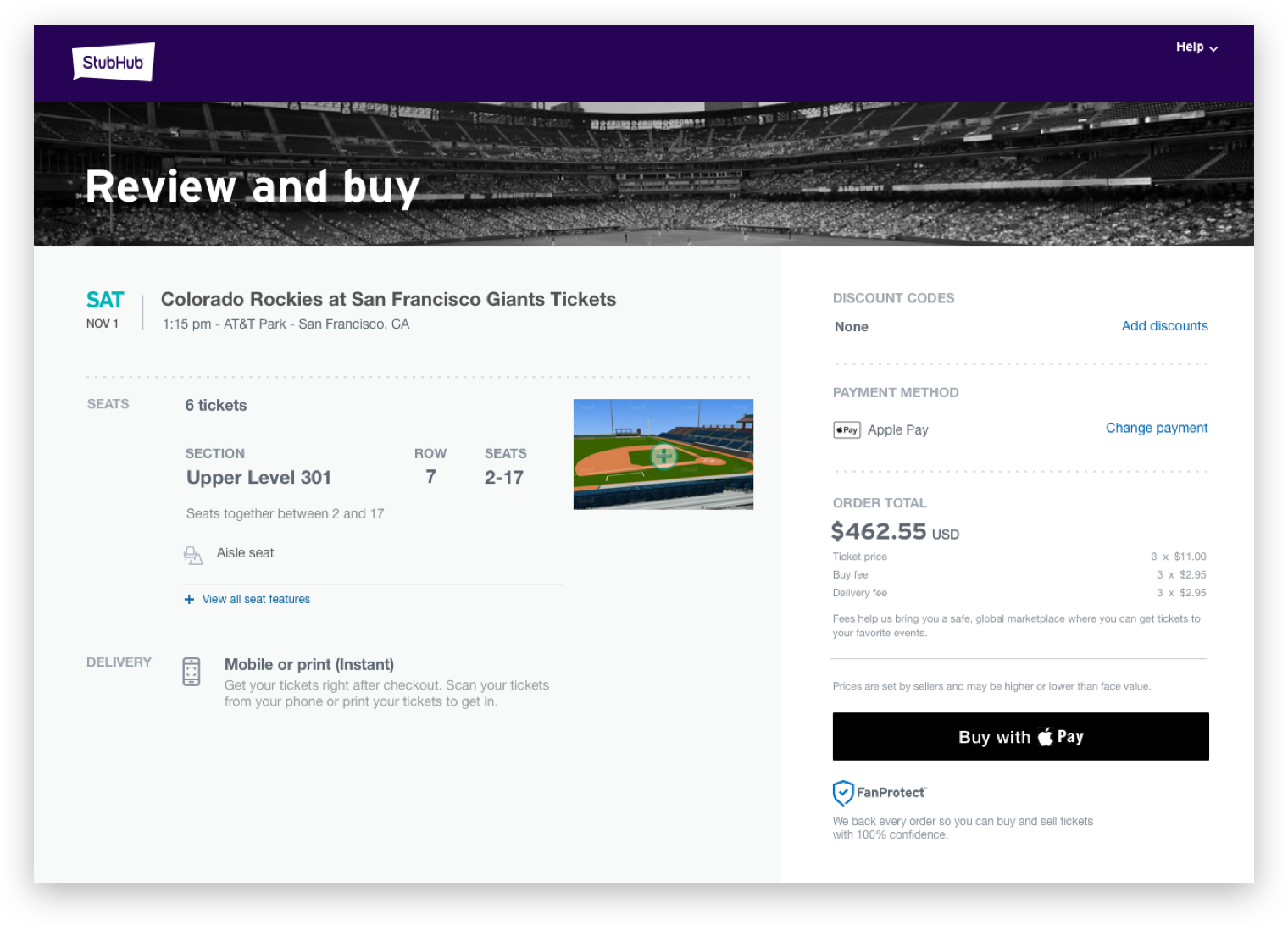
Shorter path, one-tap buying
A streamlined review-and-buy flow with Apple Pay as the default payment.
mobile conversion, and +2.5% on desktop.
Bought tickets for the wrong event
Many users overlooked the event date and didn’t notice until later.
Make the day and event impossible to miss
Visual focus on the day of the week, with the event name highlighted.
wrong-date purchases, with fewer related customer contacts.
Screens felt old, and trust suffered
Users said the design suggested StubHub wasn’t paying attention to the experience.
Refresh the brand and visuals
Updated imagery and brand elements for a modern, trustworthy feel.
Visual refresh shipped together with the flow changes.
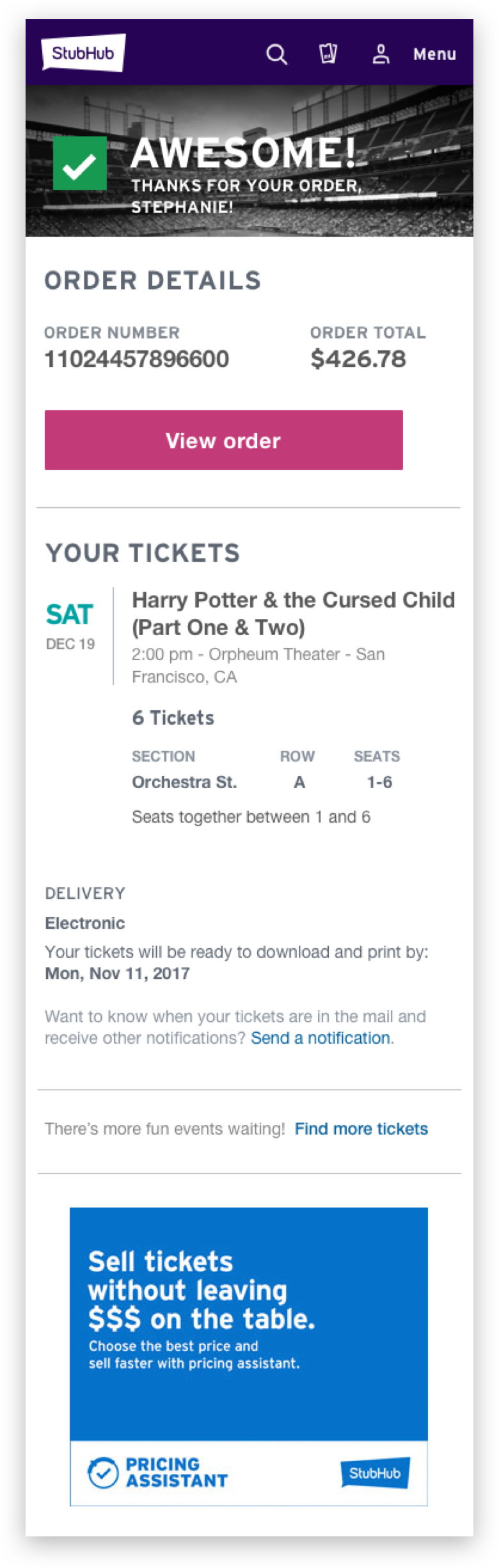
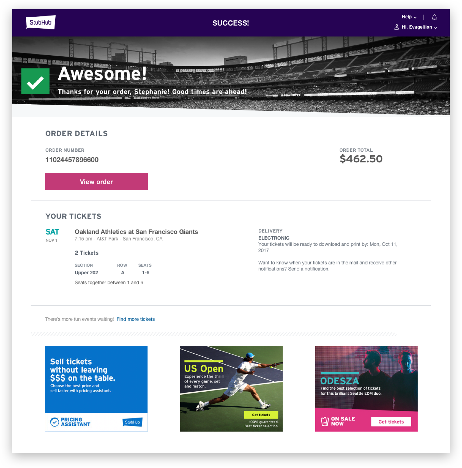
Crowded confirmation, repeat orders
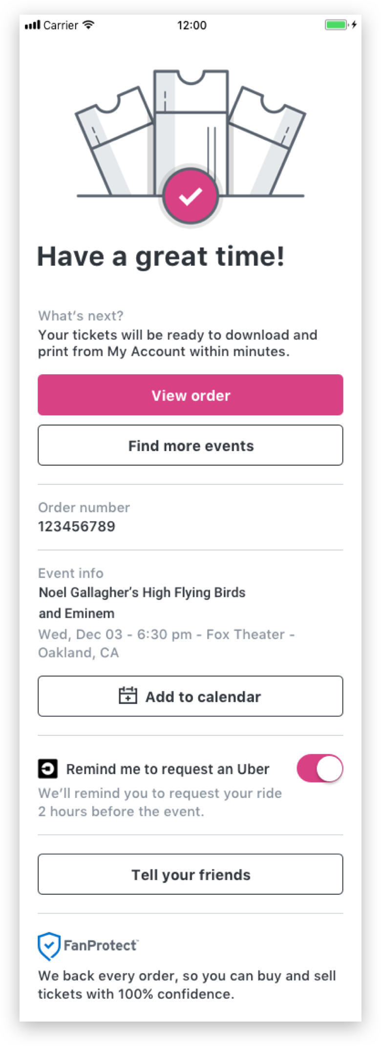
The confirmation page was so busy that users weren’t sure the order went through, and bought again.
Make success unmistakable
A clear visual confirmation that the purchase succeeded, with the next steps.
accidental double buying.
Aligning the team before drawing screens
I opened with a brainstorming workshop so the team agreed on the problem before debating solutions, then moved through flows and wireframes into A/B tests and usability research.
How might we reduce the drop-off of customers who are trying to purchase tickets?
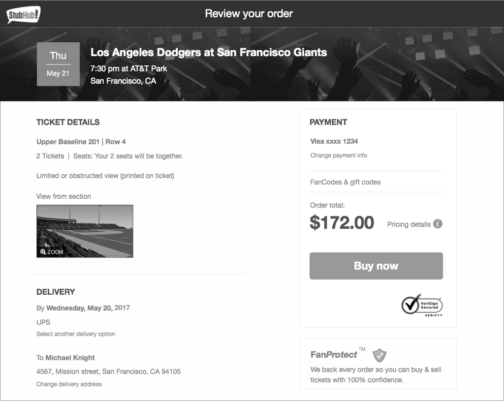
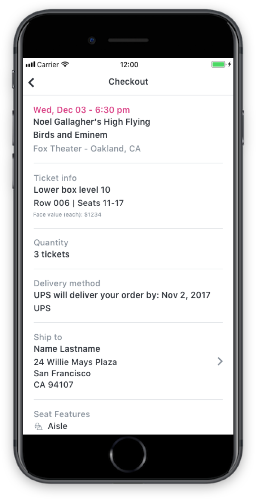
Mobile first, then web
Measured after release
Wrong-date purchases dropped, but there was still room to improve the event information section. That’s where I would push next.